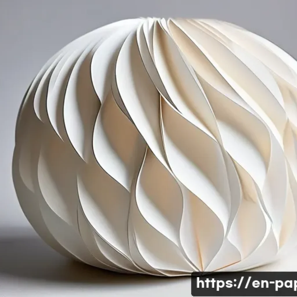
Capturing the delicate beauty of paper art through photography is an art form in itself. The interplay of light and shadow brings out intricate textures and subtle details that often go unnoticed.

Whether you’re a hobbyist or a professional photographer, understanding how to highlight these elements can transform your images from ordinary snapshots to stunning visual stories.
Experimenting with angles, lighting, and backgrounds makes all the difference in showcasing the unique charm of paper creations. Let’s dive deeper and uncover the secrets to mastering paper art photography!
Mastering Light to Reveal Texture and Depth
Harnessing Natural Light for Soft Shadows
Working with natural light is like having a gentle assistant that enhances the fine details of paper art without overpowering them. I’ve found that shooting near a window with indirect sunlight creates a soft glow that delicately highlights textures like folds, creases, and layering.
Early morning or late afternoon light tends to be less harsh, making it easier to capture the subtle nuances in paper without unwanted glare. When I position the paper slightly angled toward the light source, the shadows become more pronounced, adding dimensionality and a sense of depth that flat lighting simply can’t achieve.
Using Artificial Lighting to Sculpt Your Subject
For more controlled setups, artificial lighting gives you the freedom to play with direction and intensity. Using a single light source, like a small LED panel or a desk lamp, lets you mimic sunlight but with more precision.
Placing the light at a low angle creates dramatic shadows that emphasize the paper’s texture and shape. In my experience, diffusing the light with a softbox or even a simple white sheet helps avoid harsh reflections and keeps the image feeling natural.
Experimenting with multiple light sources can also create interesting contrasts, but it’s easy to overdo it—less is often more when capturing delicate paper art.
Balancing Shadows and Highlights for Visual Interest
The interplay between shadows and highlights is what breathes life into paper art photography. I always keep an eye on how shadows fall, making sure they add to the composition rather than distract.
Sometimes, using a reflector or white foam board opposite the light source bounces light back onto shadowed areas, softening them without eliminating contrast.
This balance prevents the image from looking too flat or too stark. It’s a subtle dance, but once you get the hang of controlling light and shadow, your photos will have a compelling three-dimensional quality that invites viewers to explore every intricate fold and cut.
Choosing the Perfect Background to Complement Your Art
Neutral Tones That Let Paper Shine
When it comes to backgrounds, simplicity often wins. I prefer neutral tones like soft grays, beiges, or off-whites because they don’t compete with the paper’s colors and textures.
These subtle backdrops provide a clean canvas that directs attention solely to the artwork. For example, a light gray matte surface can add just enough contrast to make white or pastel-colored paper pop without overwhelming the delicate details.
I’ve noticed that overly bright or patterned backgrounds tend to distract and pull focus away from the intricate craftsmanship of paper art.
Using Textured Surfaces to Add Context
Sometimes, a background with a bit of texture can enhance the narrative of your photo. Wood grain, linen fabric, or even a rough concrete surface can provide a complementary contrast that enriches the visual story.
For instance, pairing a smooth, delicate paper sculpture with a rustic wooden table creates an appealing tension between softness and roughness. I recommend testing different surfaces and paying attention to how they interact with your paper art under your chosen lighting conditions—texture in the background can either enhance or detract depending on your setup.
Creating Depth with Layered Backgrounds
Layering backgrounds is a creative way to add depth without clutter. I like to place a subtle patterned paper or fabric behind the main subject, slightly out of focus, to create a sense of space.
This technique works especially well when shooting close-ups because it frames the paper art and gives the image a professional, polished feel. Blurring the background with a shallow depth of field helps keep the focus sharp on the paper’s details while maintaining an interesting, non-intrusive backdrop.
Angles and Composition Techniques to Highlight Craftsmanship
Exploring Unconventional Perspectives
Straight-on shots are classic, but I’ve found that tilting the camera or shooting from above, below, or even from the side adds intrigue. These angles reveal hidden folds, shadows, and layering that a flat perspective misses.
For instance, shooting from a low angle can emphasize the height and depth of a folded paper sculpture, making it appear more dynamic and lifelike. Don’t be afraid to move around your subject and experiment—sometimes the best shot is the one you least expect.
Utilizing Rule of Thirds and Negative Space
Composing your shot using the rule of thirds helps create balanced and visually appealing images. Positioning the paper art off-center encourages the viewer’s eye to explore the frame rather than settling immediately in the middle.
Additionally, incorporating negative space—areas of empty or uncluttered background—around your subject allows the intricate details room to breathe. When I frame my shots with generous negative space, the paper art feels more elegant and refined, which is perfect for showcasing delicate craftsmanship.
Layering Elements Within the Frame
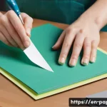
Including additional elements like scissors, cutting tools, or scraps of paper can tell a story about the creative process. When I add these props thoughtfully, they don’t steal attention but rather complement the main subject.
Layering these items in the foreground or background with careful focus control can create a sense of depth and context. This approach transforms a simple product shot into a narrative image that invites viewers to imagine the artist’s journey.
Camera Settings and Equipment Tips for Crisp Detail
Choosing the Right Lens for Close-Ups
A macro lens or a lens with close focusing capability is a game-changer when capturing the fine details of paper art. I’ve personally used a 100mm macro lens for sharp, detailed shots that reveal texture and subtle curves.
If you don’t have a dedicated macro lens, a prime lens with a wide aperture can also work well, allowing you to isolate the subject with a shallow depth of field.
Avoid zoom lenses with variable apertures for close work since they often lack the sharpness needed for intricate detail.
Optimizing Aperture and Focus for Maximum Clarity

Using a smaller aperture (higher f-number) increases depth of field, which is essential when you want the entire paper sculpture in focus. However, there’s a trade-off because very small apertures can introduce diffraction, slightly softening the image.
In my experience, apertures between f/8 and f/11 strike the perfect balance for sharpness and depth. Focus stacking is another technique worth exploring—taking multiple shots at different focus points and merging them in post-processing produces crystal-clear detail throughout the subject.
Using a Tripod and Remote Shutter for Stability
Paper art photography demands precision, and any camera shake can ruin the fine details. I always shoot on a sturdy tripod to keep the camera perfectly still, especially when working with slow shutter speeds in low light.
Pairing this with a remote shutter release or timer minimizes vibration. This setup not only improves sharpness but also allows me to experiment with exposure and composition without worrying about movement.
Post-Processing Techniques to Enhance Natural Beauty
Adjusting Contrast and Clarity Mindfully
Post-processing is where your photo can really come to life, but it’s important to avoid over-editing. I typically increase contrast and clarity slightly to make textures pop, but I keep it subtle to preserve the paper’s natural softness.
Overdoing it can make the paper look harsh or artificial, which defeats the purpose of capturing its delicate charm. Using tools like the clarity slider and contrast adjustments selectively helps maintain a balanced, realistic look.
Color Correction to Match Reality
Accurate color representation is crucial in paper art photography, especially if you’re showcasing your work for sale or portfolio purposes. I’ve learned to calibrate my monitor and shoot in RAW format, which gives me more flexibility in adjusting white balance and color tones.
Sometimes, the camera’s auto white balance can shift colors slightly, so manually correcting them in post ensures the paper’s true hues are visible. Keeping colors true-to-life enhances trustworthiness and professionalism in your images.
Sharpening Details Without Noise
Sharpening can bring out the finest edges and textures, but it’s a delicate balance because too much sharpening introduces noise or halos. I use selective sharpening techniques, focusing on the paper’s edges and textures while avoiding uniform sharpening across flat areas.
This approach keeps the image crisp and clean without unwanted artifacts. Noise reduction tools can also be applied cautiously if shooting at higher ISO settings to maintain image quality.
Essential Tools and Props for a Polished Setup
Background Materials That Are Easy to Work With
Having a variety of background materials on hand is a lifesaver. I keep several neutral-colored foam boards, textured fabrics, and wooden panels in my studio to quickly switch up looks.
These materials are lightweight, portable, and easy to clean, making them perfect for experimenting with different styles. Investing in foldable backdrops or seamless paper rolls can also streamline your workflow and help maintain a professional appearance.
Lighting Modifiers and Reflectors
Simple tools like diffusers, reflectors, and flags can dramatically improve lighting quality. I’ve used inexpensive white foam boards as reflectors to bounce light and fill shadows, while black cards help absorb unwanted reflections.
Diffusers soften harsh light sources, creating a flattering effect on delicate paper. These modifiers are indispensable for refining your lighting setup without needing expensive equipment.
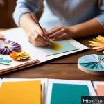
Props to Tell Your Story
Adding props related to your creative process, such as scissors, cutting mats, or colored pencils, adds personality to your photos. I find that these small touches engage viewers and make the images feel more relatable.
Choose props that complement your paper art’s color palette and style to avoid visual clutter. Remember, the goal is to enhance the story, not overshadow the main subject.
Comparing Techniques for Optimal Results
| Technique | Best Use | Pros | Cons |
|---|---|---|---|
| Natural Light Near Window | Soft, even lighting for texture | Easy setup, flattering soft shadows | Dependent on weather and time of day |
| Single Artificial Light with Diffuser | Controlled shadow sculpting | Adjustable angles and intensity | Requires additional gear and setup time |
| Macro Lens Close-Up Shots | Highlighting fine details and textures | High sharpness and detail | Expensive equipment, shallow depth of field |
| Reflectors and Bounce Cards | Softening shadows and filling light | Improves contrast and detail | Extra items to manage during shoot |
| Layered Backgrounds | Adding depth and context | Creates visual interest | Can distract if overused |
Wrapping Up
Mastering the art of lighting, background selection, composition, and post-processing can truly elevate your paper art photography. With practice and thoughtful experimentation, you’ll be able to showcase every intricate detail with stunning clarity and depth. Remember, patience and creativity go hand in hand when capturing the delicate beauty of paper craftsmanship.
Useful Tips to Keep in Mind
1. Always consider the quality and direction of light—it’s the key to revealing texture and depth in your photos.
2. Choose simple, neutral backgrounds that let your paper art take center stage without distractions.
3. Experiment with angles beyond the typical front-on shot to uncover unique perspectives and hidden details.
4. Use a tripod and remote shutter release to avoid camera shake and maintain crisp focus.
5. In post-processing, subtle adjustments to contrast, color, and sharpness will enhance your images without losing the natural feel.
Key Takeaways for Success
Lighting control is essential—natural light offers softness, while artificial light allows precision sculpting of shadows. Backgrounds should complement, not compete, with your subject, and layering can add depth when used thoughtfully. Composition techniques like the rule of thirds and negative space help balance your images, making the craftsmanship stand out. Finally, using proper equipment and careful post-processing ensures your photos reflect the true beauty of your paper art with clarity and professionalism.
Frequently Asked Questions (FAQ) 📖
Q: What type of lighting works best for photographing paper art to capture its texture and details?
A: Soft, diffused lighting is ideal for paper art photography because it minimizes harsh shadows while still highlighting the intricate textures and subtle details of the paper.
Natural light from a window on an overcast day often works beautifully, as it wraps around the paper gently. If you’re using artificial lighting, try using a lightbox or bounce your light off a white surface to create that soft effect.
Harsh direct light can flatten the image or create unwanted glare, which hides the fine craftsmanship you want to showcase.
Q: How can I use angles effectively to enhance the visual appeal of paper art photos?
A: Playing with angles is key to bringing out the dimensionality and delicate folds of paper art. Shooting slightly from the side rather than straight on can reveal shadows and depth, making the texture pop.
You might also experiment with macro shots to focus on tiny details or use a low angle to emphasize height and layers. The trick is to move around your subject and observe how light and shadow change—it’s like discovering a new story with every shift in perspective.
Q: What background choices work best to complement paper art without distracting from it?
A: Choosing the right background is crucial because it sets the tone for your paper art image. Neutral, solid-colored backgrounds like white, black, or soft pastels usually work best since they don’t compete with the artwork.
Textured or patterned backgrounds can sometimes overwhelm the delicate nature of paper art unless carefully balanced. I’ve found that using a clean, uncluttered surface helps keep the focus on the intricate details and craftsmanship, allowing the paper’s natural beauty to shine through effortlessly.